How Many Would Emigrate? Almost 7 Billion People Live in Countries Poorer Than U.S., 6 Billion in Countries Poorer Than Puerto Rico
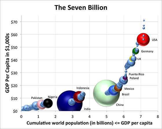
Out of the 187 countries represented by spheres, highlighted countries from bottom left to top right include: Pakistan is the pink sphere, Nigeria black, India indigo, Indonesia dark red, China mint green, Brazil blue, Mexico brown, Poland purple, UK yellow, Germany green, and USA red-white-and-blue red.
It’s hard for Westerners to grasp how many people there are in the rest of the world, which is why we often treat frivolously data points that ought to be thought-provoking, such as the Gallup Poll’s finding that 640,000,000 adults want to immigrate. To increase awareness, here’s a graph I’ve created based on the International Monetary Fund estimates for 2015. It shows that almost seven billion people live in countries with lower per capita GDPs than America’s $56,000 (red sphere), most of them much lower.
On the vertical axis is GDP per capita (PPP), while on the horizontal axis is the cumulative world population at that GDP level or lower.
Each country’s population is proportional to the area of its disk.
Under the fold is the data for this graph (downloaded from the IMF) [see original article for data]...
...the take-away lesson is that six billion people live in countries poorer than Poland and Puerto Rico...
Related video

